Samhain Journaling: Part One
According to archaeoastronomy, today is the actual crossquarter day for Samhain. I originally didn't plan to do a journaling project for Samhain this year, since I already posted the tutorials about customizing a journal. I was so inspired by the experience I had when I did the Gathering of Ancestors visualization that I had to art journal about it. Since I art journal, the tutorial below will be about what I did to create the background and start the focal on my art journal page in my Moleskine sketchbook. I will include suggestions for other types of journaling towards the bottom of this post. As always, these are meant to inspire your creativity. You don't have to do exactly what I did. You can do your own thing.
Background steps:
1. Using a watercolor pencil, Stabilo Marks All, or other water soluble media that is lighter than the colors you want to use for the base layer of your background, write out the message you received from your ancestor during the visualization. Place some waxed paper or scrap paper under your pages. I don't know about you, but I'm kind of messy when I play with paint.
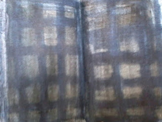
2. For the base layer of the background (see photo above), I used Tattered Angels Glimmermist in Black Magic and Tim Holtz Distress Stain in Chipped Sapphire. I used a brush to apply both inks. If you don't have spray inks or Distress inks, you can use any water soluble ink, acrylic ink, gouache, watercolors, Derwent Inktense, Faber-Castell gelatos, Distress markers, Neocolor 2s, chalk pastels, or any other water soluble media you have. You'll need two colors that blend well together. Apply each color separately, alternating between vertical and horizontal brushstrokes, covering the page or spread (2 pages facing each other) completely. Allow it to dry thoroughly once both colors have been added to the page or spread.
3. Once it's dry, add a thin layer of gel medium or a similar adhesive (such as Mod Podge or Collage Podge) over the entire page or spread. Once it has dried thoroughly, add a coat of clear gesso to the page or spread. If you don't have clear gesso, you can use slightly watered down white gesso or work directly on the gel medium. I would suggest using some kind of gesso if you have it.

4. For this step (see photo above), you'll need a stencil and some kind of paint, preferably acrylic or craft paint. I'm not the best at stenciling. I got lucky this time. If you're new to stenciling, there are some great tips to be found online, especially on YouTube (Carolyn Dube is a good one to look up). For this step, I used a Tim Holtz layering stencil called Harlequin and Golden quinacridone violet fluid acrylic paint. I don't usually use fluid acrylics with stencils. I find that heavy body acrylics work better. Anyway, decide where you want your stencil pattern to be and place it on the page. Add a little acrylic to a craft or makeup sponge, dab some of the acrylic on a scrap paper, and apply the acrylic to the stencil with the sponge, pressing lightly and quickly as you dab the paint into the stencil. Repeat until the pattern is where you want it. Clean your stencil and sponge, so they can be reused for some other project. If you don't have a stencil, you can paint small designs with a paintbrush and paint. Allow the paint to dry. When I saw the stenciled pattern on my spread, I thought, "Be still my goth heart."
5. What I thought would be some playful mark-making turned into abstract mountains. I used 3 paint colors for those lines (see photo above step 4): cobalt teal, ultramarine blue, and titanium buff (sometimes called unbleached titanium). I used a round brush to paint the lines, but you can use whatever you have or a differently shaped brush for each line. I mixed the 3 colors of acrylic paint to get the other colors. For the top line, mix a small amount of titanium buff with cobalt teal. The second line down is pure cobalt teal. The third line was a mix of equal parts cobalt teal and ultramarine blue. The fourth line is pure ultramarine blue, and the bottom line is a mix of ultramarine blue with a little titanium buff. Paint the lines in any way that is pleasing to you. If you are painting a spread, make sure your lines go from one page to the other. This creates movement and draws the eye from one side of the spread to the other.

Starting the Focal Image Steps:
1. Blocking in the woman's skin: I mixed 1/3 titanium white and 2/3 titanium buff (also called unbleached titanium) as a base layer for the skin. I chose this paint mix because I want to paint a pale skin tone and also because both paints are mostly opaque. I used a size 8 filbert brush for this, but use whatever brush you're comfortable with. Dip the paintbrush in the paint and draw an upside down egg shape with it where you'd like the head to be on your page or spread. Fill the shape in with more paint. Depending on the opacity of your paint, you may need to add more than one layer. If your head shape is wonky, you can add a little paint here or there to make it look more pleasing to you. It doesn't have to be perfect. There are a lot of things that can be adjusted during later phases of the painting. If you have room on your page, you can draw the neck and shoulders with your paintbrush then fill in the shapes you created with paint (see photo above). I only had room for one shoulder and part of the neck.
2. Blocking in the shape of the hair: For this step, I used the smallest brush I have, a 0/0 round brush, and titanium white paint to paint in wavy lines where I'd like the hair to be. Things to remember when blocking in the hair: a) Hair extends a little above the head. b) Only paint in the basic outlines. Don't go overboard. Most of these lines will be painted over in future steps. c) I mentioned movement earlier in the step where I added the five blue lines. The outlines of the mountains draw the eye to the focal character on the other page of my spread. Likewise, the lines of her hair draw the eye back to the top of the mountain. This may be something you'll want to consider when composing your piece. d) The lines don't need to be perfect. They'll be painted over in another step. e) I favor wild, wavy hair, but you can look at photos for reference regarding what other hairstyles look like.
That's it for part one. I'll most likely post the second part of the tutorial later tonight and the third/final part sometime Sunday. I've been sick all week, so I'm a little behind on things.

Background steps:
1. Using a watercolor pencil, Stabilo Marks All, or other water soluble media that is lighter than the colors you want to use for the base layer of your background, write out the message you received from your ancestor during the visualization. Place some waxed paper or scrap paper under your pages. I don't know about you, but I'm kind of messy when I play with paint.
2. For the base layer of the background (see photo above), I used Tattered Angels Glimmermist in Black Magic and Tim Holtz Distress Stain in Chipped Sapphire. I used a brush to apply both inks. If you don't have spray inks or Distress inks, you can use any water soluble ink, acrylic ink, gouache, watercolors, Derwent Inktense, Faber-Castell gelatos, Distress markers, Neocolor 2s, chalk pastels, or any other water soluble media you have. You'll need two colors that blend well together. Apply each color separately, alternating between vertical and horizontal brushstrokes, covering the page or spread (2 pages facing each other) completely. Allow it to dry thoroughly once both colors have been added to the page or spread.
3. Once it's dry, add a thin layer of gel medium or a similar adhesive (such as Mod Podge or Collage Podge) over the entire page or spread. Once it has dried thoroughly, add a coat of clear gesso to the page or spread. If you don't have clear gesso, you can use slightly watered down white gesso or work directly on the gel medium. I would suggest using some kind of gesso if you have it.

4. For this step (see photo above), you'll need a stencil and some kind of paint, preferably acrylic or craft paint. I'm not the best at stenciling. I got lucky this time. If you're new to stenciling, there are some great tips to be found online, especially on YouTube (Carolyn Dube is a good one to look up). For this step, I used a Tim Holtz layering stencil called Harlequin and Golden quinacridone violet fluid acrylic paint. I don't usually use fluid acrylics with stencils. I find that heavy body acrylics work better. Anyway, decide where you want your stencil pattern to be and place it on the page. Add a little acrylic to a craft or makeup sponge, dab some of the acrylic on a scrap paper, and apply the acrylic to the stencil with the sponge, pressing lightly and quickly as you dab the paint into the stencil. Repeat until the pattern is where you want it. Clean your stencil and sponge, so they can be reused for some other project. If you don't have a stencil, you can paint small designs with a paintbrush and paint. Allow the paint to dry. When I saw the stenciled pattern on my spread, I thought, "Be still my goth heart."
5. What I thought would be some playful mark-making turned into abstract mountains. I used 3 paint colors for those lines (see photo above step 4): cobalt teal, ultramarine blue, and titanium buff (sometimes called unbleached titanium). I used a round brush to paint the lines, but you can use whatever you have or a differently shaped brush for each line. I mixed the 3 colors of acrylic paint to get the other colors. For the top line, mix a small amount of titanium buff with cobalt teal. The second line down is pure cobalt teal. The third line was a mix of equal parts cobalt teal and ultramarine blue. The fourth line is pure ultramarine blue, and the bottom line is a mix of ultramarine blue with a little titanium buff. Paint the lines in any way that is pleasing to you. If you are painting a spread, make sure your lines go from one page to the other. This creates movement and draws the eye from one side of the spread to the other.

Starting the Focal Image Steps:
1. Blocking in the woman's skin: I mixed 1/3 titanium white and 2/3 titanium buff (also called unbleached titanium) as a base layer for the skin. I chose this paint mix because I want to paint a pale skin tone and also because both paints are mostly opaque. I used a size 8 filbert brush for this, but use whatever brush you're comfortable with. Dip the paintbrush in the paint and draw an upside down egg shape with it where you'd like the head to be on your page or spread. Fill the shape in with more paint. Depending on the opacity of your paint, you may need to add more than one layer. If your head shape is wonky, you can add a little paint here or there to make it look more pleasing to you. It doesn't have to be perfect. There are a lot of things that can be adjusted during later phases of the painting. If you have room on your page, you can draw the neck and shoulders with your paintbrush then fill in the shapes you created with paint (see photo above). I only had room for one shoulder and part of the neck.
2. Blocking in the shape of the hair: For this step, I used the smallest brush I have, a 0/0 round brush, and titanium white paint to paint in wavy lines where I'd like the hair to be. Things to remember when blocking in the hair: a) Hair extends a little above the head. b) Only paint in the basic outlines. Don't go overboard. Most of these lines will be painted over in future steps. c) I mentioned movement earlier in the step where I added the five blue lines. The outlines of the mountains draw the eye to the focal character on the other page of my spread. Likewise, the lines of her hair draw the eye back to the top of the mountain. This may be something you'll want to consider when composing your piece. d) The lines don't need to be perfect. They'll be painted over in another step. e) I favor wild, wavy hair, but you can look at photos for reference regarding what other hairstyles look like.
That's it for part one. I'll most likely post the second part of the tutorial later tonight and the third/final part sometime Sunday. I've been sick all week, so I'm a little behind on things.
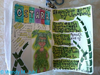
- Suggestions for other types of visual journaling: a) After doing the visualization, sketch or draw the scene that stood out to you the most. b) sketch or draw the ancestor who sat across from you on the boulder. c) Collage or paint colors and patterns that express how you felt during the visualization, then write the message you were given in fancy lettering or stamping. d) Create an abstract painting expressing your feelings about this time of year. e) Illustrate your favorite things about this time of year in your journal.
- Writing Prompts: a) Write a description of what you saw/felt/heard during the Gathering of Ancestors visualization. b) The message my ancestor gave me was...This made me feel... c) If I could journey into the past, I would like to meet...We would talk about...I would want to learn...from them. I would use this knowledge in the present time for... d) Make a list of all the priceless things that you've learned from your friends and family. Why are they important? e) If I could do anything loving for myself over the next year, it would be...
That's all for today. I would love it if you'd share your creations and writing in the comments below.
Wendy

Comments
Post a Comment